Bicycle design… is boring
Published:
Updated:
May 26, 2015
May 20, 2024
I bet that title caught your attention!?
Let me expand on that. Bicycle ‘design’ is boring and I mean both in terms of visual appeal and in terms of design and designing. It’s funny when you think about it but somehow, in the world of bicycles, we seem to have ended up with a never ending rehash of the same basic concept. Can you imagine if automotive or consumer product design was the same? What would our world look like, if fundamentally we were using all the latest and greatest technology, only to recreate something that has not changed all that much for over a hundred years?
What am I talking about? Bicycle frames, the double triangle and the endless rehash year in year out. Sounds like I’m an ignorant loon, right? Quite clearly, when it comes to anything made from metal, the double triangle, made with round tubes, no silly bends and clean joins, is as efficient and as light as it can get. But when it comes to materials like carbon, one has to say WTF?!

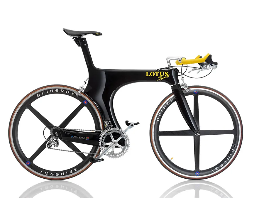
Mike Burrows’ legendary Lotus frame. This is probably the bike that scared a bunch of old men in their sleep.
I have a strong interest in bicycle design as can be seen by some of the stuff I’ve written in the past (bicycle dynamics and 650b placebo effect for example). It’s an interest that stems back to the days of when I wanted to, and did for a stint, design motorcycles to earn a crust. Things on two wheels that go fast are simply a fascination for me.

56 of each made it out of the factory in Taiwan before it was killed off… before it began.
Over the past few years at ELEVEN vélo, we’ve had numerous aborted starts at doing our own frames, after I spent several years designing a line of frames for the now defunct Mountain Cycle Inc. None of our attempts took off, not for lack of available skills but more because, well, I just kept on ending up asking myself (especially after we recently came to within a few millimeters of pulling the trigger on the project… again), just why do we want to do yet *another* double triangle frame, regardless of the material?
Without a doubt, true progression in bicycle frame design came to a sudden and brisk halt in 1996, when *that* organisation, the UCI, dropped what is known as the ‘Lugano Charter’ on the cycling world. If you are not familiar with it, walk into any bike store or watch any race and look at the road bikes – what you see is a direct result of that charter. In a nut shell, somewhere along the line a bunch of old, arguably (or maybe not) corrupt, men decided that allowing cycling technology to progress with the advance of materials etc. was not quite on. So in a stroke of infinite wisdom, they mandated that all frames that were to be raced in any UCI event, had to be of the double triangle variety (along with a whole bunch of other regulatory rules, some of which were thinly disguised as ‘safety’ concerns). It seems that things were getting a bit radical and some old timers were loosing sleep over frames that were getting a bit, erm, ‘modern’ in their thinking. While parameters are good, making everyone stick to something that’s over one hundred years old reeks of, well, mothballs and tweed jackets (to make things even more interesting, the UCI recently instigated a money making scheme where frame to be race in UCI events had to have a little, rather expensive, sticker saying that they were ‘UCI approved – smell a rat?).

The Zipp frame, even with it’s peculiarities was widely accepted in the triathalon world for being a perfect TT design.
Oh but what about all those crazy mountain bike designs we see? Well, it’s been widely accepted that if the UCI tried the same trick on the mountain bike world, the rowdy mountain bikers would have been given them the finger (after a swig of beer), packed up their helmet bags and full finger gloves and gone off and done their own thing (it could be argued they should have anyway). Better to appease than to loose a massive revenue… umm segment of the cycling world.
So you see, ever since 1996, every company out there that has any interest in putting bikes in the realm of big time racing has had to suck up the double triangle and move forward with it, regardless of how right or wrong it is. And this is where the folly lies. In a world of carbon, now so prevalent that it’s almost ubiquitous, vast sums of money are being spent to engineer frames from carbon that mimic a structure optimised for round metal tubes. Carbon’s core strength, the ability to create very stiff and strong skins, is being thrown out the window to create ultimately sub optimal designs – forming little tubes and glueing them all together (yes, if you didn’t know, the vast majority of carbon frames are made from multiple parts bonded together). Yea, that’s smart and progressive. Sure they’re lighter than most of their metal counterparts but still. Cycling is the only industry that uses carbon en masse in this fashion.
Madness.

Something more recent, the Pearson Z1 aero frame
But madder still, the market is such that what’s good for the top is good for the rest of us, so that means everyone else in the world who rides a bike has to effectively also ride what the UCI thinks a bike should be, regardless of how out dated that concept may be. Factories are geared up for it and change in the world of cycling fabrication is slow and generally unwilling. The status quo is set. So while we see designers and engineers in bike companies bang their nuts trying to make the most swoopy double triangle designs they can in the name of market differentiation, all that’s happening is convergence, and ultimately everything ends up at the same end point. How many times have you heard the comment that bike ‘X’ looks like bike ‘Y’? That’s design convergence.
Ho hum.

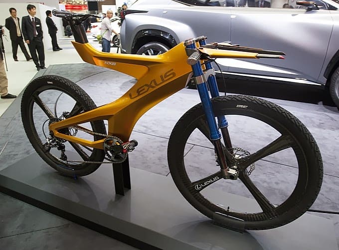
And while it’s a good example of just why car designers need to stay away from bicycles, the Lexus concept frame does show glimpses of what could be.
So what ever happened to the Lotus frames, Zipp bikes and all those mad, exciting designs we saw in the mid 90’s? Well, the UCI happened. Just think of what the cycling landscape, for everyone who rides, might look like if no one gave a shit what the UCI thought?
g
Gerard
I've sold titanium, designed and sold cycling rags, was co-conspirator for Australia's first major MTB website, run mtb events, designed bikes, and was a GM and head designer for a famous but sadly now extinct mtb bike marquee; and after 20 odd years I decided riding bikes was more fun than working with them.
Today I pedal (boom-tish!) cycling t-shirts